CONTEXTO: MOBILE APP
Leveraging advancements in modern LLM's to help foreign language learners in their journey to achieve fluency.
Role: UX/UI Design, Branding
Duration: 8 weeks
Background: learning a new language is more than just memorizing vocabulary and conjugating verbs. Everything exists within a complex cultural and lexical context. The current approach of many modern apps feels more like a gamified approach to part the user with their time and money. We now have the power of AI to act as a personal language tutor that can challenge users to interact in ways that they would in real world scenarios. With this new power, intermediate and advanced level language learners can be engaged in realistic scenarios that would otherwise not be available to them outside of an immersive experience like traveling or university.

Problem: Intermediate to advanced level foreign language learners have few chances to practice outside of a classroom or immersive experience.

How might we make a realistic learning experience that helps intermediate to advanced language learners feel more confident in achieving fluency?
EMPATHY STAGE
To get a better understanding of the learning process and user pain points, I conducted 5 remote user interviews with intermediate to advanced level language learners. My goal was to get a sense of what is missing in the current market for language learning apps, specifically how to bridge the gap that exists for learners trying to achieve a confident level of fluency by using technology.
What I found most interesting is that all of the fluent interviewees could pinpoint when they felt like they had achieved fluency and most shared the same feedback around their preferred learning approach. The consistency across participants helped to inform my affinity mapping.
FigJam File (Interactive)

PERSONAS
Through the empathy stage research, I developed 3 user persona examples of my ideal users. These users are a synthesis of my interview participants but with differing motivations for needing an app like Contexto.
Figma File (Interactive)

LO-FI WIREFRAMES
After conducting a competition analysis, making brand identify guides and creating a logo for Contexto, I moved into the Low Fidelity wire framing stage of the UX process. I got feedback from peers and potential users for how they felt about the layout of a few options for the main home page and lesson screens.
Figma File (Interactive)

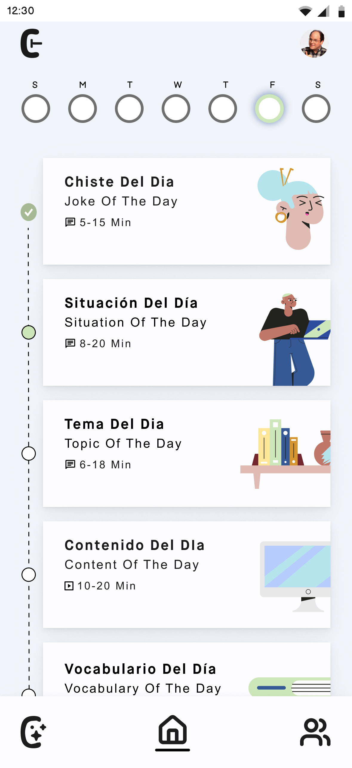
HI-FI PROTOTYPE
Iterations of low fidelity wireframes lead me to the final high fidelity testable prototype. I designed the MVP to test 4 different user flows that would cover all aspects of the final product. I conducted a series of usability tests with 4 participants to test and discover any design or usability issues. From this stage I identified a handful of improvements to be made to the UI for a better user experience and an increased understanding of how the product can be useful.
Figma File (Interactive)

ITERATIONS
After conducting user test on my high fidelity prototype, I got to working on my iterations based on feedback. I made a few changes, specifically around differentiating the color for the language chat. That way the user could better distinguish what text was from the LLM and what they typed. I also updated the vocabulary lesson structure to better reflect how users expected what would happen when they got an answer correct or incorrect.
You can test the prototype for yourself below.
Figma File (Interactive)

Solution: A daily language “workout” program. Like a personal trainer for learning a new language, using AI to give users five different language exercises each day to mimic the ways that lead my target user group to achieve language fluency.
Reflection: my research lead me to discover a common thread among fleunt and advanced level new language learners. Each participant that achieved fluency in a new language had a different answer when asked how they felt they were confidnent in the flow of fluency. Each lesson in Contexto is geared towards the various answers to that question and my attempt to capture in technology what they experienced in real life.